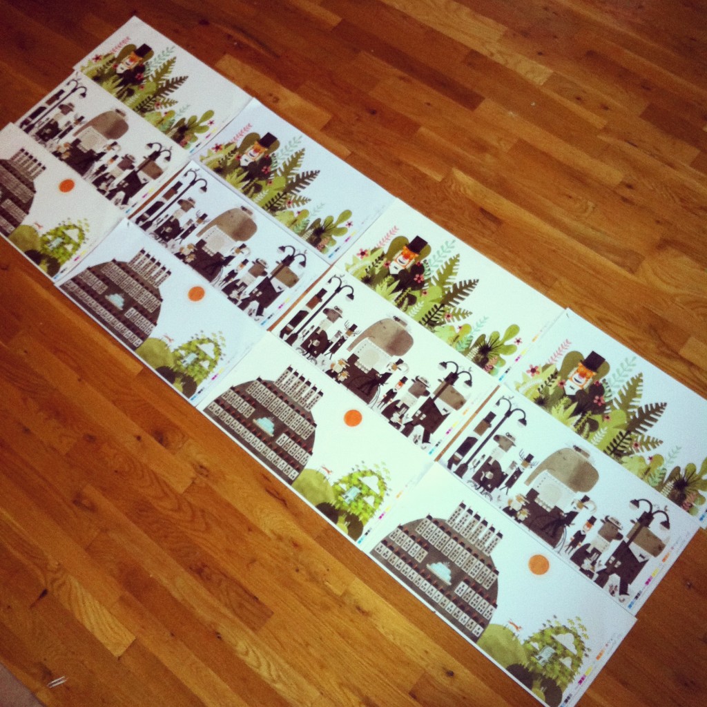
I’ve spent most of the last few months in my “art cave.” I’m working on the final artwork for my next children’s book, and as usual, I’m behind schedule, which means I don’t do much besides eat, sleep and work. It’s not ideal, but it seems to be what happens with every one of my books. Sheesh. In an effort to move things along, my very patient art director (Patti Ann Harris at Little, Brown and Co.) asked for a few of the finished pieces of art so that she could test out different papers and colors. And I just received a package in the mail with those test proofs!
I’ll save the juicy details of this new book for future blog posts, when I’m not completely overwhelmed with my workload, but in this slightly blurry photo (thank you iPhone) you can actually see how some of the papers are cooler and some warmer. We like the warmer papers, since it jives better with the warm color palette. We still have a lot to figure out, like whether we use coated paper (glossy) or uncoated paper (not glossy), whether we use a fifth color (most books are printed with only four colors: cyan, magenta, yellow and black) and if so, WHICH color we’ll use, not to mention some of the design and production issues. Oh, and did I mention I still have more art to make?! Gah!!!
Ok, back to work…


